BLOG · MR DETAILING DESIGN
7 Visual Aid Design Mistakes That Kill MR Detailing
A medical representative gets roughly 90 seconds in front of a busy doctor. In that window, the visual aid is doing half the selling. So when a detailing call falls flat, the problem is not always the rep, the product, or the doctor's mood. Very often, it is the artwork on the table.
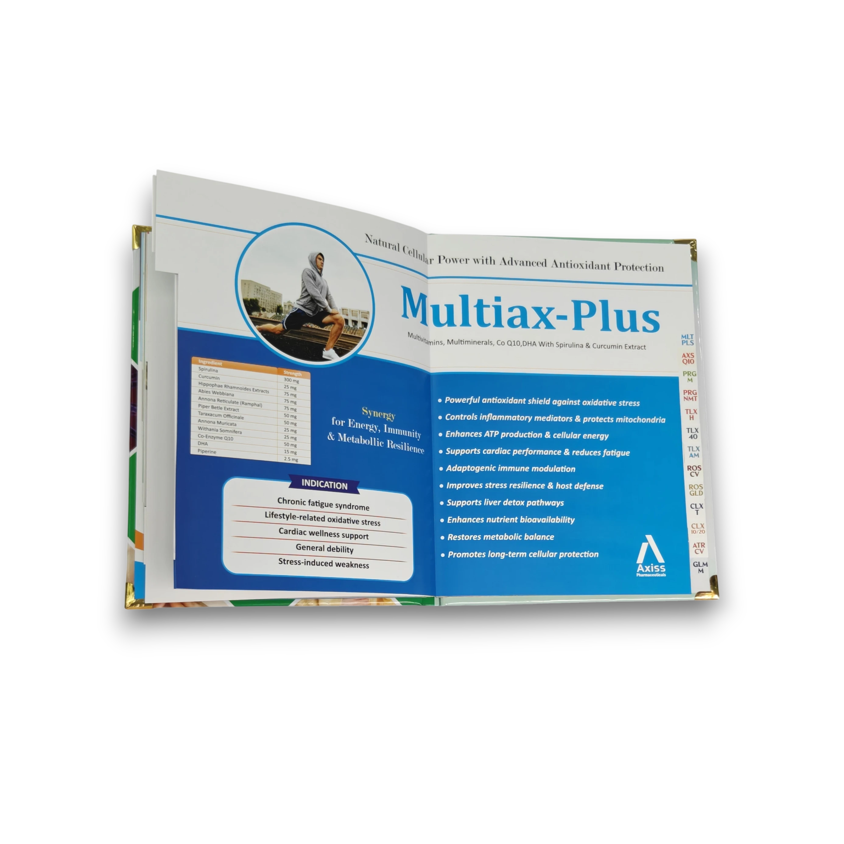
The most damaging visual aid design mistakes are the ones that look harmless in approval but fail during the doctor call. Overloaded pages, weak images, poor contrast, unreadable charts and inconsistent branding can all reduce doctor attention before the MR has finished the first sentence.
At RX Design Hub, we design and print pharma visual aids, prescription pads, reminder cards and connected collateral for pharma companies across India. After handling thousands of pages, these are the seven mistakes we see most often, why each one weakens MR detailing, and how to fix it. For a basics-first guide, read what a pharma visual aid is before this audit checklist.
1. Cramming the whole product story onto one page
The most common visual aid design mistake is fear of white space. Brand teams want the molecule, indication, clinical graph, dosage, four claims and a product pack on the opening spread. The result is a wall of text a doctor's eye bounces straight off.
Detailing is a conversation, not a leaflet. A doctor does not read a visual aid line by line; they glance and listen. When every page screams for attention, nothing gets remembered.
Fix: use one core message per page, one hero visual and enough breathing room that the eye knows where to land first. A 12-page book that flows beats a 6-page book that suffocates.
2. Using clip-art and low-resolution images
A doctor evaluates your brand's seriousness in the first two seconds. Pixelated stock photos, generic clip-art doctors and stretched logos tell the wrong story immediately. A blurry mechanism-of-action graphic does not just look bad; it makes the claim beside it feel weaker.
Image quality is credibility. Every key visual should be print-resolution, properly licensed or custom-made, and consistent in style across the book. Compare the difference on our visual aid design samples page.
Fix: avoid random web images and mixed illustration styles. Use clean 300 DPI artwork, properly prepared brand logos and custom clinical visuals where mechanism or patient education matters.
3. Ignoring the 90-second detailing flow
Many visual aids are designed as documents to be read at a desk, not tools to be flipped during a live call. The pages do not follow the natural arc of a detailing conversation: hook, problem, mechanism, evidence, dosage and ask. The MR then jumps back and forth, breaking their own rhythm.
A good visual aid sequence makes even a new rep sound structured. This is especially important when building a visual aid for MR teams, because the same book must support hundreds of short doctor calls in different territories.
Fix: plan page order around the spoken pitch. The opening page should earn attention, the middle should build the clinical case, and the final page should make the prescription ask easy.
4. Poor colour and contrast choices
Colour is not decoration in a visual aid; it is navigation. Low-contrast text, grey copy on beige backgrounds, thin type over a busy image and six competing brand colours all make the doctor's eye work too hard.
Remember where visual aids are used: crowded clinics, fluorescent tube light and very little time. What looks subtle on a designer's monitor can disappear on the doctor's table.
Fix: anchor the palette to the brand, keep body copy high-contrast and reserve one accent colour for the single most important claim on each page. Before approval, view the printed proof at arm's length under ordinary clinic-like lighting.
5. Making clinical data unreadable
Efficacy graphs are where good intentions often fail. A pharma visual aid may reproduce a journal chart exactly as published: dense axes, tiny footnotes and four overlapping lines. It feels rigorous, but a doctor cannot absorb it in a glance.
The answer is not to fake data. It is to present real data clearly. Redraw the chart with one clear takeaway, a bold headline number and readable labels while keeping the reference intact.
Fix: turn complex journal figures into doctor-call visuals: one comparison, one headline, one citation. Same data, faster understanding.
6. Inconsistent branding across the range
When your visual aid, prescription pads, reminder cards and chemist books all look like they came from different companies, you lose the compounding effect of repetition. A doctor should see the same identity across every touchpoint.
This mistake shows up at scale, so it is often missed. Mismatched logos, fonts and colours reset memory instead of building it.
Fix: build one design system for the full product range: same logo treatment, type logic, colour hierarchy and print finish language. Keeping products under one roof makes this much easier.
7. Treating printing and finishing as an afterthought
You can get every design decision right and still lose quality at the printer. Thin paper that curls, dull colours, binding that cracks, lamination that peels and corners that fray all cheapen a premium design instantly.
Design and production are one job, not two. Choosing GSM, finish and binding is part of the design decision because doctors judge quality by touch as much as sight. Our visual aids page explains how design, print and binding work together, and the visual aid printing price guide explains which specs affect cost.
Fix: finalize the print spec before design approval: size, page count, paper GSM, lamination, binding, corner finishing and delivery packing. A beautiful file is not enough; the finished book must survive the field.
Quick recap: the 7 mistakes
- Overcrowding the page with too many messages.
- Using low-resolution, generic or inconsistent imagery.
- Ignoring the 90-second MR detailing flow.
- Choosing weak colour contrast and confusing hierarchy.
- Making clinical data too dense to read quickly.
- Allowing inconsistent branding across collateral.
- Leaving paper, binding and finishing decisions too late.
If even three of these appear in your current book, it is worth reviewing the design before your next cycle meeting. You can also read how to choose a visual aid design company if you are comparing vendors.
Questions and Answers
What is the most common visual aid design mistake?
Overcrowding. Trying to fit the entire product story onto one page makes the doctor work too hard. One clear message per page almost always performs better during MR detailing.
How do I know if my visual aid is hurting detailing calls?
Look for field signs: reps flip back and forth, doctors do not pause on any page, charts need explanation before they make sense, or the book looks different from your other pharma collateral.
Can an existing visual aid be fixed without full redesign?
Yes, in many cases. Resequencing pages, cleaning a data chart, improving contrast or tightening the claim hierarchy can lift the call without rebuilding every page.
What should be checked before printing a visual aid?
Check CMYK artwork, 300 DPI images, proper bleed, margins, paper GSM, lamination type, binding method, page order and whether the key claim is readable from arm's length.
Should a visual aid match prescription pads and reminder cards?
Yes. Consistent branding across visual aids, prescription pads, reminder cards and chemist books builds repeated recall. Mixed designs make one company look like many small vendors.
Can RX Design Hub audit my current visual aid?
Yes. Send your current book or PDF on WhatsApp and RX Design Hub can point out the design, flow, data, print and branding issues before you decide on correction or redesign.
What is the single biggest visual aid mistake?
Overcrowding is the most common because it hides every other strength. One clear message per page gives the doctor and MR an obvious route through the call.
Can a bad visual aid actually reduce prescriptions?
A visual aid cannot determine prescribing alone, but poor hierarchy can waste attention, weaken understanding and reduce brand recall during an already short interaction.
Should I fix or fully redesign my visual aid?
Fix it when the core story is sound and a few pages need hierarchy or production changes. Redesign when positioning, sequence and identity fail throughout the book.
How do I know if my current aid is working?
Ask MRs which pages they use, skip or struggle to explain. Look for consistent recall of the intended message and review whether the call can be completed without jumping around.
Get a free visual aid design audit
Send us your current detailing book on WhatsApp. We will point out which design mistakes are costing you attention and show the practical fix before you commit to anything.
Related reading
- The Complete Pharma Visual Aid Guide for Medical Representatives
- Pharma Visual Aid Cost in India 2026: Budget Planning Guide
- Pharma Visual Aid Designing Services
- Visual Aid Design Samples
- How to design a pharma visual aid, step by step
- Best pharma visual aid companies in India (2026 comparison)
Use the visual aid pre-print checklist before approval, and see our typography rules for visual aids for readable composition lines.