Practitioner guide · Design process
How to Design a Pharma Visual Aid
Learning how to design a pharma visual aid starts with the doctor call, not with colours or software. The book must help an MR introduce a problem, connect the product to a useful benefit, show credible proof and leave one strong memory within a short conversation.
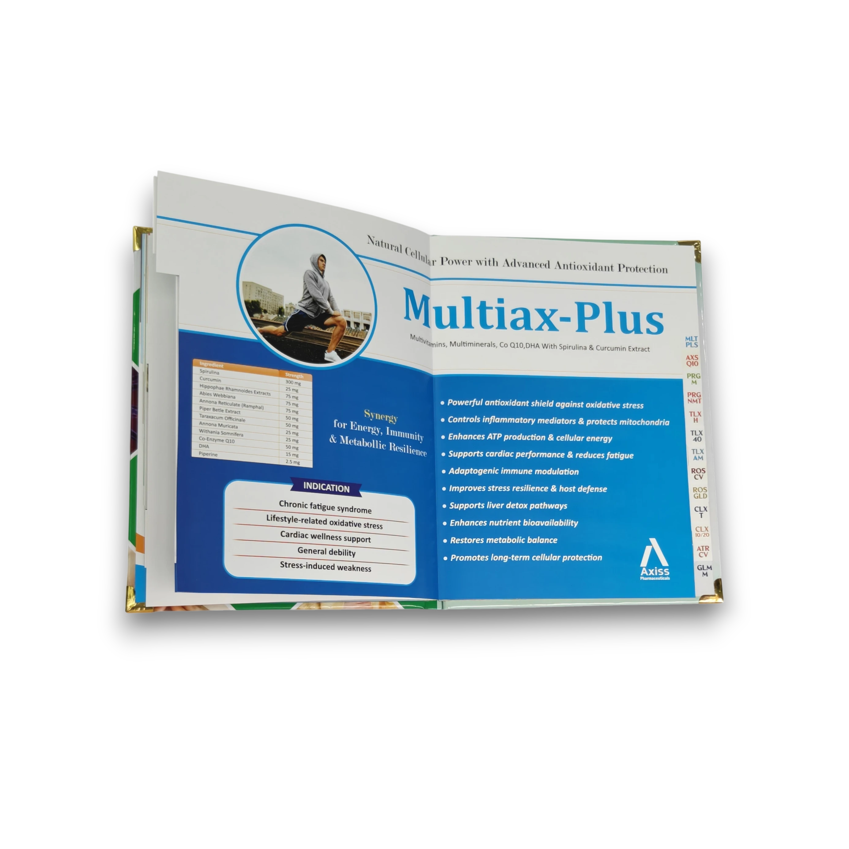
A great visual aid creates recall in roughly 90 seconds to three minutes. Define the target doctor, give each page one job, sequence the story from problem to benefit, simplify evidence and design the physical book for real field handling.
Step 1: Define the target doctor first
Write down the specialty, patient situation, current prescribing habit and likely objection before writing a headline. A physician, dermatologist and orthopaedic specialist do not enter the same clinical conversation, even when the product can be used across specialties. The page order and evidence should match the person hearing the detail.
Then define one outcome for the call: should the doctor remember a faster effect, a convenient dose, a specific patient profile or a differentiated mechanism? This becomes the filter for every page. If content does not support the call outcome, it may belong in a reference sheet rather than the main detailing flow.
Step 2: Use one page, one message, one benefit
Each page should help the MR say one clear sentence. The headline names the message, the visual attracts attention and the supporting copy or evidence proves it. When a page contains four equal claims, the doctor has to choose what matters; when the hierarchy is deliberate, the designer has already made that choice.
“One benefit” does not mean hiding mandatory detail. Dosage, references and safety information still need accurate placement. It means separating information by role so the page can be understood at a glance while the MR speaks.
Hold a printed page at arm's length and give yourself three seconds. If you cannot identify the headline, main visual and brand immediately, the hierarchy is not ready for a busy clinic.
Step 3: Build the page-by-page blueprint
| Page role | What it should do | Useful question |
|---|---|---|
| Cover | Open the conversation with a relevant patient or brand promise | Why should the doctor look at page two? |
| Problem | Make the clinical or patient tension recognisable | Which unmet need is present today? |
| Solution | Introduce the brand and mechanism as an answer | How does this product address the problem? |
| Proof | Show one credible comparison, study result or rationale | What makes the benefit believable? |
| Benefit | Translate the evidence into a doctor or patient outcome | Why does it matter in practice? |
| Close / CTA | Reinforce brand, patient fit, dose and prescribing ask | What should be remembered after the book closes? |
This is a blueprint, not a rigid six-page rule. Complex therapy may need several proof or indication pages; a simple launch may need fewer. The discipline is that every spread advances the conversation instead of repeating the cover claim in new colours.
Step 4: Apply layout and readability rules
- Build a clear reading order: headline first, visual second, proof or support third, brand anchor always visible.
- Use real contrast: body text must remain readable under clinic lighting, not only on a bright monitor.
- Protect white space: empty space separates ideas and helps the doctor know where to look.
- Design for the binding: keep claims and faces away from spiral holes, folds and pasted inner margins.
- Keep references readable: concise does not mean microscopic; move dense source detail to a consistent reference area.
Print a draft at actual size. A PDF viewed at “fit to screen” hides small type and narrow margins. Physical testing also reveals glare, colour shifts and whether a landscape spread feels comfortable in the MR's hand.
Step 5: Turn clinical data into simple visuals
Begin with the claim the evidence genuinely supports, then decide which comparison makes that claim easiest to understand. Remove decorative grid lines, competing colours and labels that do not help the doctor interpret the result. Keep the scale honest, preserve the reference and never visually exaggerate a difference.
A good chart has a takeaway headline, one highlighted series and labels large enough for a live call. The MR can explain the context; the visual should make the central result visible before the explanation ends.
Step 6: Design for recall with a signature visual
A signature visual can be a patient scene, a recurring shape, a recognisable colour relationship or a simple metaphor connected to the benefit. It should repeat with restraint across the cover, key proof and closing page. Repetition builds recognition; random visual novelty resets it.
Extend the same device into the leave-behind or reminder card. When the doctor sees the connected item later, the visual can retrieve the earlier detailing story.
Common design mistakes to avoid
The fastest way to weaken this process is to overload the page, lead with the molecule instead of the patient benefit, shrink references, reproduce journal tables without simplification or choose a finish after artwork is approved. Our dedicated guide to mistakes to avoid pairs each failure with its business cost and practical fix.
Before production, run one final checklist: claims approved, packs current, page order locked, images high resolution, bleed present, margins safe, finish agreed and a physical proof reviewed where colour is critical.
Send your current PDF or a few page photos. We will flag the clearest design, print and detailing improvements before you place an order.
Ask for the free review on WhatsAppFrequently asked questions
How many pages should a visual aid have?
Most single-brand MR visual aids work well at roughly 8–16 pages. The right number depends on products and call length; each page should have one necessary role.
Should the molecule name be on the cover?
It can be, but it should not automatically overpower the patient benefit or opening idea. The cover must earn attention and prepare the doctor for the story.
How much text is too much?
If the MR must wait for the doctor to read a paragraph before continuing, the page is too dense. Use a clear headline, short support and readable references.
Do I need a designer or can I do it myself?
A simple internal draft can organise content, but professional pharma design helps with hierarchy, evidence graphics, brand consistency and print-ready production.
How often should I redesign my visual aid?
Review it when claims, packs, evidence, positioning or field feedback changes. Do not redesign only for novelty; update when the story or use has a reason to improve.
Continue planning your visual aid
Get help with your visual aid structure
Send your product content or current PDF for a free review of the page flow and detailing hierarchy.