BLOG · Design Guide
Typography for Visual Aids: Making Compositions Readable at a Glance
# Typography for Visual Aids: Making Compositions Readable at a Glance
Get a free readability audit
# Typography for Visual Aids: Making Compositions Readable at a Glance
A doctor does not read a visual aid the way you read it at your desk. It sits on the table, facing the doctor from across the desk, often at an angle, under clinic lighting, while the MR is speaking. The doctor gives each page a few seconds at most.
In those conditions, typography decides whether your message gets through. A beautiful layout with small, cramped text fails. A plain layout with clear, well-sized text works. Here are the rules we follow when setting type on pharma visual aids.
Design for the real reading distance
Most visual aid pages are seen from roughly an arm's length away — the width of a doctor's desk. At that distance, text that looks comfortable on a laptop screen becomes a grey blur.
The mistake happens because designers judge text size while zoomed in on a monitor. Always judge text on paper, at the distance the doctor will see it.
Our working minimum sizes
These are the minimums we use for a standard A4 visual aid. For A5, move each level up rather than scaling down.
| Element | Minimum size (A4) | Why |
|---|---|---|
| Brand name on product pages | 36 pt or larger | It must be the first thing seen and remembered |
| Main page headline / key claim | 24 pt | This is the message the doctor takes away |
| Supporting points | 14 pt | Read only if the doctor leans in |
| Composition line | 12 pt | Must be legible without effort, never squeezed |
| Dosage and pack details | 11 pt | Checked, not studied |
| References and footnotes | 7–8 pt | Read later, not during the call |
The rule behind the table: nothing the MR will point to during the call should be smaller than the composition line. If it is, either the text is unnecessary or the page is overloaded.
How to set a long composition line
Composition lines are where visual aid typography most often breaks. Combination products produce long molecule names, and the natural instinct is to condense the font or cut the size so it fits on one line. Don't.
Break at the plus sign. Set each molecule on its own line, with the strength aligned at the end:
Glimepiride 2 mg Metformin HCl (SR) 500 mg
Keep strengths prominent. Set the strength in bold or a heavier weight. It is the detail a doctor checks most often.
Avoid all capitals for long names. Capitals remove the shape of the word, and long molecule names become harder to read. Use sentence case for molecules and keep capitals for the brand name.
Never condense or stretch the font. Artificially squeezed letters are the fastest way to make a composition line look careless — and to hide a spelling mistake.
Keep it identical everywhere. The composition should be set in the same style on every page it appears.
Choosing fonts
- Use a clean sans-serif for claims and body text. Simple letter shapes survive distance, angle and glossy paper better.
- Limit yourself to two font families. One for the brand and headlines, one for everything else. More than two makes the book look disorganised.
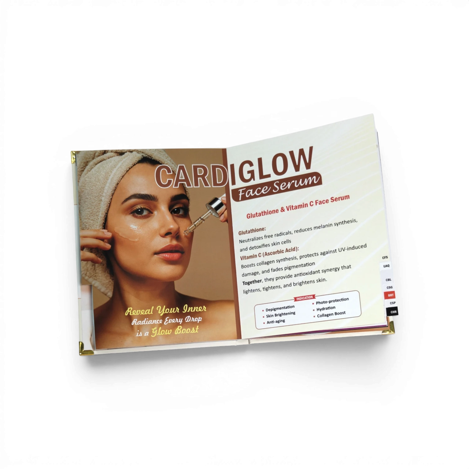
- Avoid decorative and script fonts for anything that must be read. Keep them, if at all, for the brand logo.
- Pick a font with clear numbers. Strengths, percentages and study results must be unambiguous. Check that 1, 7, 3 and 8 are clearly different.
- For Hindi or regional-language pages, use a proper Devanagari typeface rather than a font that only partially supports the script, which can break conjunct characters.
Contrast and background
- Dark text on a light background remains the most readable choice for text-heavy pages.
- Do not place text over busy photographs. If you must, add a solid panel behind the text.
- Watch light brand colours. Pale yellow, light green or light blue text can disappear under clinic lighting.
- Think about lamination. Gloss lamination reflects light and can wash out small text. For text-heavy pages, matt lamination usually reads better.
Line length and alignment
- Keep claim lines short — around 8 to 12 words is a comfortable range.
- Left-align body text. Centred text is fine for short headlines but tiring for anything longer.
- Give lines enough breathing space; cramped line spacing makes paragraphs look heavier than they are.
- Use a simple table for dosage schedules instead of a paragraph.
The arm's-length print test
Before approving any visual aid, do this:
- Print one product page at 100% size on the actual paper type, if possible.
- Place it flat on a desk and step back to the other side of the table.
- Check whether you can read the brand name, headline and composition without leaning in.
- Narrow your eyes slightly. The brand name should still stand out as the strongest element.
- Ask someone who has not seen the page to tell you the main message in five seconds.
If the page fails any of these, fix the typography before touching the colours or images.
This connects directly to the 8-second rule: if a doctor cannot read it quickly, the page does not exist.
Frequently asked questions
Can we use a smaller font to fit more content on one page? It is better to cut content or add a page. A page with less text that is read fully does more work than a crowded page that is skipped.
Should the brand name use the same font as the logo? On product pages, the brand name should match the logo styling for recall. Everywhere else, use your chosen readable typeface.
Does paper type affect readability? Yes. Heavy glossy stock with gloss lamination can create glare. Matt finishes generally make dense text easier to read under clinic lights.
You can see how these rules look in practice in our real visual aid design samples, and use the visual aid design checklist before you approve your next file.
---
Not sure your current visual aid passes? Send us the PDF on WhatsApp for a free readability audit. We will mark the pages where text size, contrast or the composition line needs attention.
Get a free readability audit