BLOG · PRESCRIPTION PAD GUIDE
Prescription Pad Design & Printing: Format, Rules and Best Practices
A prescription pad looks like the simplest thing a pharma company will ever print. It is also the item a doctor touches more times a day than any brochure, visual aid or gift you will ever hand them. That is exactly why the details matter: a pad the doctor finds cramped, unclear or unprofessional gets pushed into a drawer, and your brand goes with it.
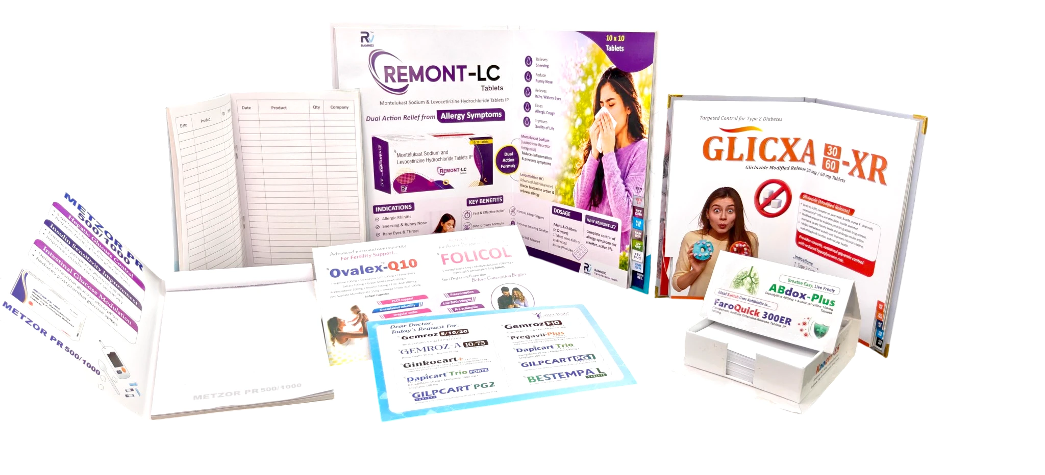
A good prescription pad has a clear doctor block, a clinic block, the Rx symbol, room to actually write, and the details a doctor asks for — registration number, clinic timings and a second address. Get the anatomy, the paper and the writing space right and the pad becomes a daily-used desk fixture rather than a drawer filler.
At RX Design Hub we design and print prescription pads alongside visual aids and reminder cards for pharma companies across India, so we see the small changes that decide whether a doctor keeps a pad on the desk or sets it aside. This guide covers the correct anatomy, the things doctors consistently ask to have on the pad, the prescribing conventions to respect, and the print specifications that hold up to daily use.
The anatomy of a prescription pad
A prescription pad follows a layout that has barely changed in decades, because it works. From top to bottom:
- Doctor block (top): the doctor's name, qualifications, specialty and registration number. This is the identity of the pad and doctors are particular about it.
- Clinic / hospital block: address, consultation timings, phone number, and often a second clinic address. Frequently placed opposite the doctor block or across the header.
- Patient fields: name, age and sex, date, and often weight (essential for paediatric prescribing). A clean, aligned row of fields signals a well-designed pad.
- The Rx symbol: the superscription that opens the body of the prescription.
- Body / writing area: the open, usually lightly ruled space where the doctor writes drugs and directions. This must be generous — more on that below.
- Footer: signature line, next-visit or follow-up note, and sometimes an emergency contact or clinic branding.
The classic prescription structure (for context)
Clinically, a full written prescription has four parts your layout should never crowd: the superscription (the Rx symbol), the inscription (the drug and strength), the subscription (instructions to the pharmacist), and the signatura (directions for the patient). Your job in design is to leave enough clear, well-lit space for all four to be written legibly.
What doctors always ask to be on the pad
After printing thousands of pads, the same requests come back regardless of specialty. If you build these in from the start, you avoid a second proof cycle:
- The registration number, clearly. Doctors want their medical council registration number present and legible — it is part of a valid prescription and a mark of authenticity.
- Consultation timings. Especially for doctors who split time between a clinic and a hospital, timings reduce patient confusion and repeat calls.
- A second clinic address. Many doctors consult at more than one location and want both listed.
- Room to write. The single most common complaint about a pad is a cramped writing area. Doctors would rather have a slightly larger pad than a crowded one.
- Their own identity, not the drug brand, up top. The doctor block should feel like the doctor's stationery. Pharma branding, where present, is usually a discreet strip or footer, not a dominant header.
- An emergency or reception number in the footer for urgent patient contact.
Pro tip: before finalising, print one sample pad and ask the doctor to write a real prescription on it. Cramped rows, a tight Rx column, or a signature line too close to the edge only show up when a pen actually touches the paper.
Prescribing conventions to respect in India
A prescription pad is a medico-legal document, so the design should support good prescribing practice rather than get in its way. A few principles worth building around:
- Legibility first. National Medical Commission guidance emphasises legible prescriptions, and encourages prescribing drugs by their generic names, written clearly — often in capital letters. Your layout should give the doctor room to do this without squeezing.
- Registration number present. A doctor's registration number is expected on a valid prescription, so the design should give it a fixed, legible place.
- Keep the doctor's pad ethical. A doctor's prescription pad is the doctor's document. Heavy product branding on it sits uncomfortably with pharma marketing codes, so keep any company presence subtle and secondary.
These are guiding principles for design, not legal advice — a doctor or clinic should confirm the exact fields they are required to carry. Your job as the printer is to make the compliant version also the good-looking, usable version.
Print specifications that survive daily use
A pad is used and torn dozens of times a day, so the production spec matters as much as the layout.
| Specification | Common choice | Why |
|---|---|---|
| Size | A5 (also A6 for compact pads, A4 for detailed ones) | A5 balances writing room with desk footprint |
| Paper | Around 70–100 GSM maplitho / bond | Takes ink cleanly and tears well from the pad |
| Sheets per pad | 50 or 100 leaves | Standard, refill-friendly quantities |
| Single vs duplicate | Single, or NCR carbonless duplicate | Duplicate keeps a copy for records |
| Binding | Top padding gum, optional numbering | Clean single-sheet tear-off |
| 1 or 2 colour, or full colour with a logo | Most pads are simple; branding stays light |
Pro tip: if a doctor wants a copy retained for the clinic, choose an NCR carbonless duplicate pad rather than asking them to use loose carbon paper. It is cleaner, faster and looks far more professional on the desk.
How to print on a pre-printed prescription pad
Many clinics now type prescriptions in software and print them onto branded sheets. The printed header and footer stay fixed, so the only job is to make the software's text land in the blank writing area. This is the routine that works on most office laser and inkjet printers:
- Order loose sheets, not a gummed pad. Printers cannot feed glued pads. Ask for the same design as cut A5 (or A4) sheets, ideally around 80 GSM so they feed without jamming.
- Measure the printed header and footer. Use a ruler on one sheet and note how many millimetres the doctor block takes at the top and the footer takes at the bottom.
- Set the page size and margins in the software. Choose A5 (148 × 210 mm) as the paper size and set the top and bottom margins slightly larger than your measurements, so typed text starts below the header.
- Turn off the software's own letterhead. Otherwise the doctor's name prints twice, once on the pre-printed header and once from the software.
- Test on plain paper first. Print one page on plain paper, place it over a branded sheet and hold both against light. Adjust the margins until the text sits inside the writing area.
- Load the branded sheets the right way up. Mark the tray with which side and which edge goes in first, so staff do not waste sheets.
If the clinic both hand-writes and prints, order two versions: a gummed pad for the desk and loose sheets for the printer, from the same artwork. You can order both from our prescription pad printing page.
Design best practices in one place
- Give the writing area more space than you think you need.
- Keep the doctor and clinic blocks clean and easy to scan.
- Place the registration number and timings where they are always visible.
- Keep pharma branding subtle — a footer strip, not a headline.
- Match the pad to the doctor's other collateral so the brand system stays consistent.
- Test with a real pen before the full run.
A prescription pad is a small print job with an outsized return: it puts your brand on the doctor's desk every single working day. Design it as carefully as you would a visual aid and it earns its place instead of a drawer.
How do I print on a pre-printed prescription pad?
Use loose branded sheets instead of a gummed pad, set the software paper size to A5 with top and bottom margins larger than the printed header and footer, turn off the software letterhead, and test on plain paper held against a branded sheet before printing.
What should be printed on a prescription pad?
A doctor block (name, qualifications, specialty and registration number), a clinic block (address, consultation timings, phone, often a second address), patient fields (name, age, sex, date, and weight for paediatrics), the Rx symbol, a generous writing area, and a footer with a signature line and follow-up or emergency contact.
What size and paper is best for a prescription pad?
A5 is the most common size because it balances writing room with desk footprint; A6 suits compact pads and A4 suits detailed ones. Paper is usually around 70 to 100 GSM maplitho or bond so it takes ink cleanly and tears well. Pads are typically 50 or 100 leaves in the market; RX Design Hub’s standard pads are 8 × 5 in or 5 × 3.5 in with 40 perforated sheets of 80 GSM watermarked paper.
What do doctors most often ask to have on their pad?
A clearly legible registration number, consultation timings, a second clinic address where relevant, plenty of room to write, their own identity kept prominent over any drug branding, and an emergency or reception number in the footer.
Should pharma branding appear on a doctor's prescription pad?
It should be subtle. A prescription pad is the doctor's own document, so heavy product branding sits uncomfortably with pharma marketing codes. Any company presence is usually a discreet footer strip rather than a dominant header.
What is a duplicate or NCR prescription pad?
An NCR (no carbon required) carbonless duplicate pad automatically keeps a second copy of each prescription for the clinic's records, without loose carbon paper. It is cleaner and more professional than single sheets when a copy needs to be retained.
Are there rules about how a prescription should be written in India?
National Medical Commission guidance emphasises legible prescriptions and encourages prescribing by generic names, written clearly. A valid prescription is also expected to carry the doctor's registration number. These are principles the pad design should support; the doctor or clinic should confirm the exact fields they must carry.
Can RX Design Hub print prescription pads to match our other collateral?
Yes. Prescription pads can be designed as part of the same visual system as your visual aids, chit pads and reminder cards, so the brand stays consistent across everything on the doctor's desk. Share your details on WhatsApp for a same-day quote.
Order prescription pads doctors actually like using
Send your doctor and clinic details on WhatsApp. We will design a clean, compliant, easy-to-write pad matched to your other collateral, and share a same-day quote.