BLOG · PRE-PRINT ACCURACY
Composition, Dosage, Indication: Getting Rx Details Right on Print
A visual aid can survive an average layout. It cannot survive a wrong strength. The composition, dosage and indication lines are the smallest text on most pages and the most important, because they are the lines a doctor checks and the ones that cannot be explained away once printed.
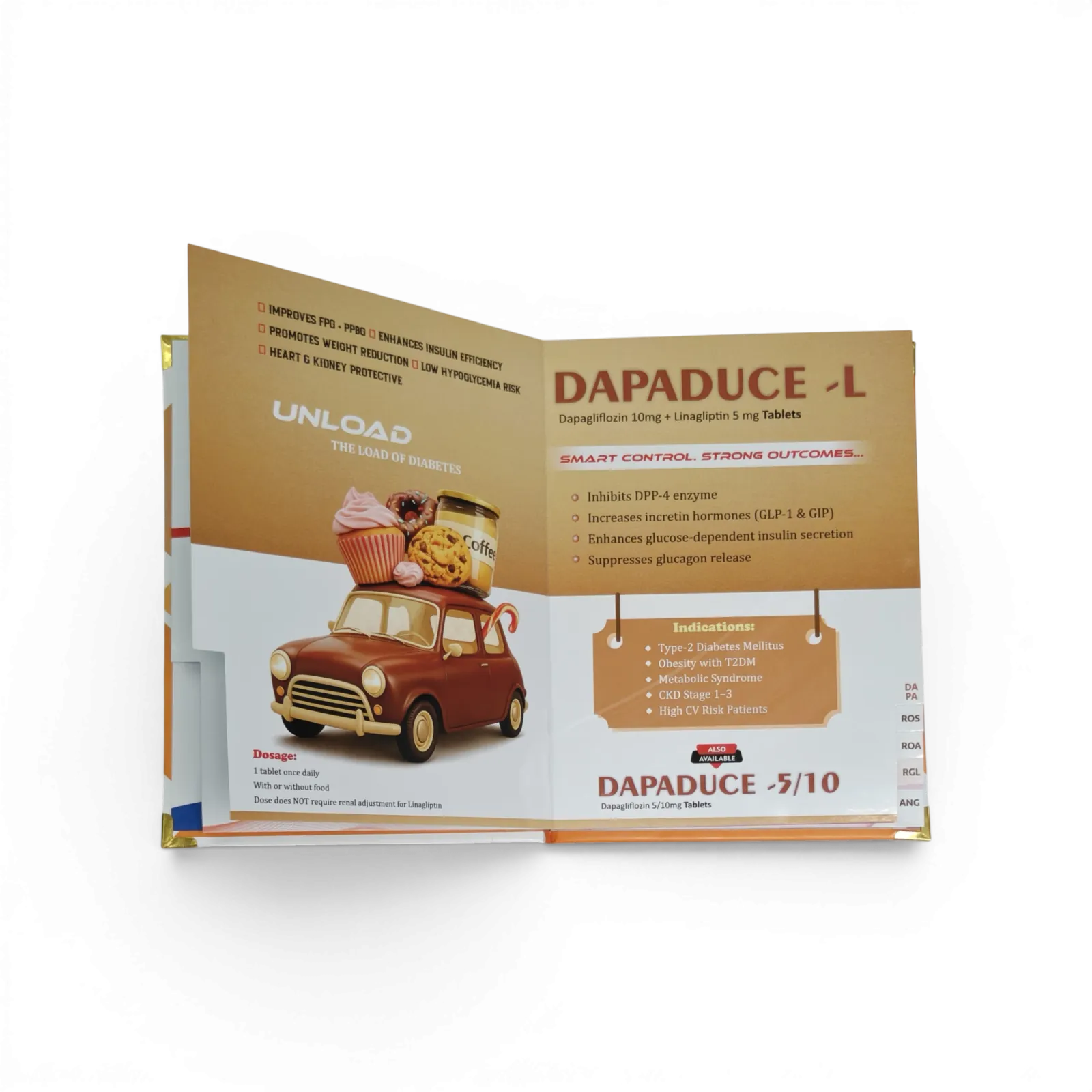
Rx details on pharma print are the product facts that must match the approved product exactly: brand name, generic composition with salt form and strength, dosage form and release type, approved indications, and dosage. Check them against the current carton and the approved prescribing information, not against the previous visual aid, and check them again after every correction round.
Most of the files that reach our design desk are well designed. What goes wrong is quieter: a salt name dropped to make a line fit, "SR" missing from one page out of twelve, a syrup strength written without "per 5 ml". Each one looks like a typo. To a doctor it reads as carelessness about the product itself, and after printing it costs a full reprint to fix.
This guide covers what each Rx detail must contain, the errors that slip through most often, and a simple order of checking that catches them before the file goes to press.
Why these lines carry more risk than the rest of the page
Three things make product details different from every other line on a visual aid.
They are checked, not read. A doctor skims the headline but checks the strength and dose, because that is what they will write on the prescription. An error here is noticed even when the rest of the page is ignored.
They repeat across the book. The composition can appear on the cover, the molecule page, the dosage page and the closing page. A change made on one page and missed on three others is the most common way errors enter a file.
They outlive the campaign. A claim can be updated next cycle. A printed book with a wrong strength stays in the MR's bag until someone physically pulls it back.
Promotional material is also expected to be accurate, balanced and consistent with the product's approved information. Under India's Uniform Code for Pharmaceutical Marketing Practices (UCPMP 2024), claims have to be supportable, so the safest working rule is simple: if a detail is not on the approved pack or prescribing information, it does not go on the page.
What each Rx detail must contain
Use this as the reference for every product page.
| Detail | What it must include | Common slip |
|---|---|---|
| Brand name | Exact spelling, capitalisation and ® or ™ as on the pack | Old logo version, wrong case |
| Composition | Every molecule with its salt form and strength per unit | "Metformin" instead of "Metformin Hydrochloride" |
| Strength unit | mg, mcg, IU or % exactly as approved, per tablet, per capsule or per 5 ml | mcg printed as mg; syrups missing "per 5 ml" |
| Release type | SR, ER, MR, CR, DT, ODT or EC where applicable | Suffix dropped on one page only |
| Dosage form and pack | Tablet, capsule, syrup, injection; current pack size | Old pack size after a pack change |
| Indications | Only approved indications, worded consistently | A broader indication used in a headline |
| Dosage | Dose, frequency and population as per prescribing information | Adult dose shown on a paediatric page |
| Status markings | Prescription-only status shown consistently with the pack | Marking present on some pages, missing on others |
Two rows deserve extra attention.
Salt form. "Metformin" and "Metformin Hydrochloride" are not interchangeable on print, and neither are "Amlodipine" and "Amlodipine Besilate". Designers shorten salt names because long combination lines do not fit. The fix is a better layout, not a shorter name. Our typography guide shows how to break a long composition line at the plus sign instead of condensing it.
Strength basis. For liquids, the strength means nothing without its volume: "250 mg" and "250 mg per 5 ml" are different statements. For combination products, every component needs its own strength, in the same order on every page.
The errors that slip through most often
These are the patterns that show up again and again when files are checked before printing. None of them are rare, and almost all of them enter during corrections rather than in the first draft.
- The page that was not updated. A strength or pack change is applied to the dosage page but not to the cover or closing page. Search the file for every occurrence of the composition, not just the page the correction mentioned.
- Copy-paste from an old brand. A new product page is built from an older one, and a molecule name or strength from the old brand survives in a corner.
- Units changed by autocorrect or font swaps. The micro sign in "µg" disappears when a font does not support it, or "mcg" is retyped as "mg". Always check units character by character in the final PDF, not the design file.
- Indication drift. The indication page is correct, but a punchy headline on another page implies a wider use. Headlines are claims too.
- Dosage without population. A dose is shown without saying whether it is for adults or children, or a paediatric product shows an adult regimen.
- Brand name styled two ways. The logo says one thing and the body text another: a space added, a capital lost, a different suffix.
Check from the source, not from the last version. If last year's visual aid is used as the reference, its mistakes are copied forward. Use the current carton, label and approved prescribing information every time.
A checking order that catches errors
Checking everything at once is how errors are missed, because the eye is busy with layout. Check in passes, each with one job.
- Lock the master data first. Before design starts, put brand name, full composition, strengths, dosage form, pack, indications and dosage in one short master sheet, approved by the brand or medical team. Every page is then checked against that sheet.
- Composition pass. Search the PDF for each molecule name. Count the occurrences and check every one against the master sheet.
- Units and numbers pass. Read every number aloud with its unit: "five hundred milligrams, per tablet". Reading aloud is slower, which is the point.
- Indication and claims pass. Read every headline and claim, and ask: is this inside the approved indication, and is there a reference for it?
- Dosage pass. Compare the dosage page with any dosage table, pack shot or reminder line elsewhere in the book.
- Final-file pass. Repeat the composition pass on the exact file that will be printed, after the last correction.
Give the composition and claims passes to the brand or medical team, and the layout and print passes to the designer. When one person does both, the composition line gets the least attention because it looks "obviously right". Our full visual aid design checklist splits these responsibilities stage by stage.
Keeping Rx details right across the whole range
The same composition usually appears on the visual aid, the prescription pad footer, the reminder card and the LBL. When the pack changes, all of them change. Keep one master sheet per brand and update it before touching any artwork, then list every item that carries the composition so nothing is left on an old version. Our guide to reprints and version control covers how to name files and log changes so the next reprint uses the right version.
How we handle it
At RX Design Hub, we start a new visual aid from the brand name and composition you send, and we confirm the master details back to you before page design begins. On every proof, composition and strength lines are checked against what you approved. If something in your file does not match the pack photo you shared, we flag it rather than print it. The medical and regulatory responsibility for claims stays with your team, and we make sure what you approved is exactly what gets printed.
Frequently asked questions
What Rx details must be printed on a pharma visual aid?
The brand name, the full generic composition with salt form and strength, the dosage form and release type, the approved indications and the dosage. All of them should match the current pack and the approved prescribing information exactly.
Should the salt name be included in the composition?
Yes. Print the composition exactly as approved, including the salt form, such as Metformin Hydrochloride rather than Metformin. If the line is too long, change the layout instead of shortening the name.
Who is responsible for checking composition and claims?
The pharma company's brand or medical team is responsible for the accuracy of composition, claims and indications. The design and print partner should check the file against what was approved and flag anything that does not match.
When do most Rx detail errors enter a visual aid?
During corrections. A change is made on one page and missed on others where the same detail appears. Search the final PDF for every occurrence of the composition before approving.
How do I avoid wrong units like mg and mcg?
Check units in the final PDF, not the design file, read every number aloud with its unit, and confirm that the font used supports special characters like the micro sign.
Get a free pre-print Rx details check
Send your final PDF and the current pack or carton photo on WhatsApp. We will mark every composition, strength and dosage line that does not match.