MR Detailing Insight · Last updated: 26 July 2026
How Doctors Actually Read a Visual Aid: The 8-Second Rule
In doctor visual aid detailing, a page often gets only a quick scan before the conversation moves on. The practical 8-second rule says the main claim, its proof and the brand meaning should register within one short glance. It is a field-review framework, not a laboratory measure of human attention.
This doctor visual aid detailing guide turns that brief glance into a usable design sequence for MRs and pharma brand teams. It draws on visual aids RX Design Hub has produced for 1,000+ clients and the practical handling patterns our team considers when designing for field use.
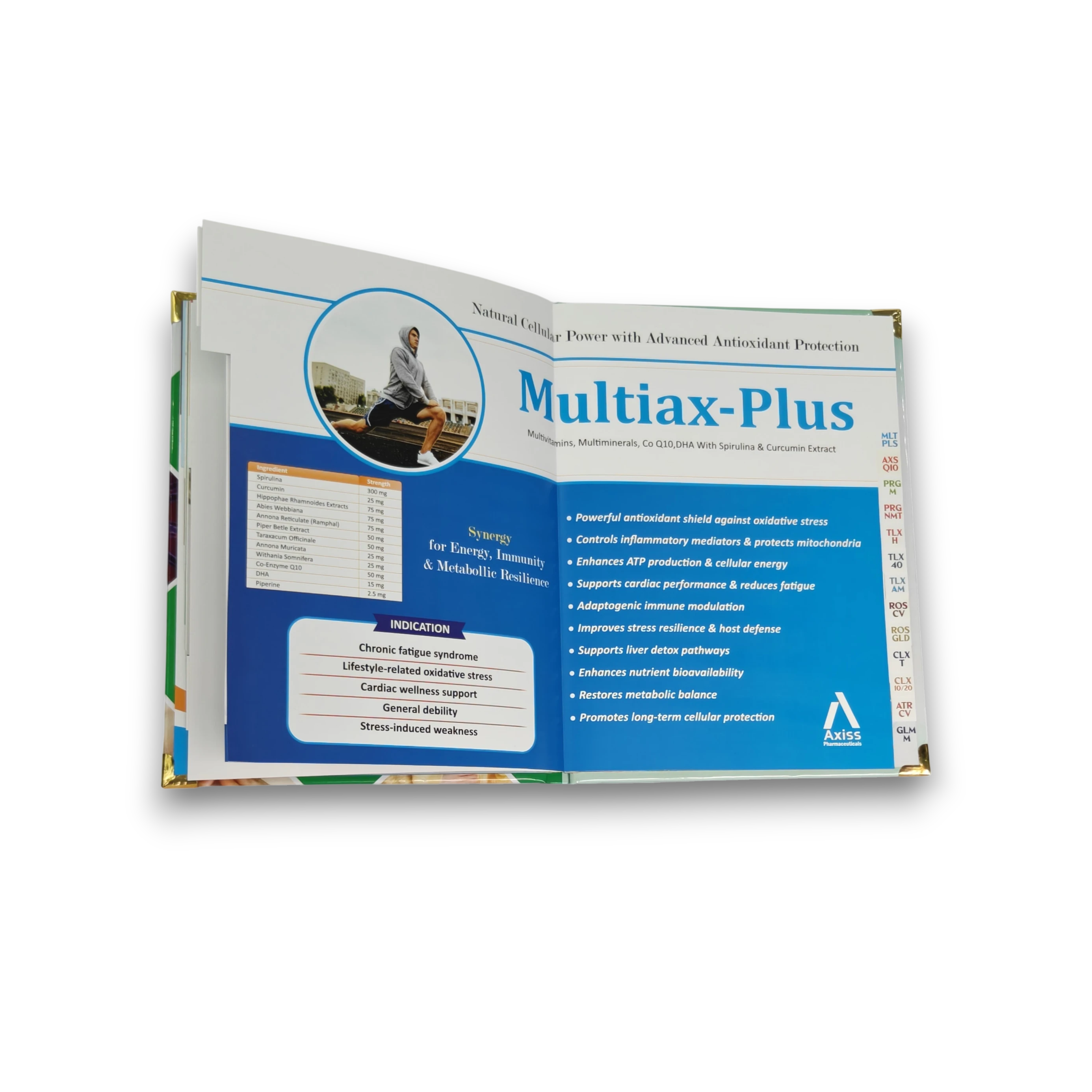
The reality of doctor visual aid detailing
A detailing call is not a quiet reading session. The doctor may be between patients, listening to the MR, checking the waiting room and deciding whether the brand is relevant at the same time. A good doctor visual aid detailing page therefore has two jobs: support the spoken story and reduce the effort needed to understand it. A page that requires line-by-line reading asks for attention the setting rarely provides.
The popular claim that humans have an eight-second attention span is contested, and it should not be used as evidence for an MR–doctor call. Research about doctors interrupting patients also studies doctor–patient consultations, not pharma detailing. The framework here makes a narrower, more honest point: if a page cannot communicate its priority quickly, the MR spends precious time explaining the layout instead of the brand.
Good pharma detailing acknowledges divided attention. The MR should open at the correct page, point to the dominant idea and give the proof without searching. The doctor should be able to look away and retain one takeaway. That is why hierarchy matters more than fitting every approved sentence.
How a doctor’s eye moves across a visual aid page
The eye does not read every element in order. In doctor visual aid detailing, it first lands on the strongest focal point: a face, product visual, large headline, bold number or high-contrast chart. It then seeks context and evidence before registering the brand anchor and supporting copy.
Designers often describe common reading paths as an F pattern for text-heavy layouts and a Z pattern for simpler promotional layouts. These are not rigid laws. Their value is practical: they remind the team that size, contrast, spacing and placement create an order even when no one consciously notices it. In doctor visual aid detailing, that order should match the MR’s spoken sequence.
A strong page therefore has a deliberate chain: focal point, claim, proof, brand. The dominant image earns the glance. The headline explains why it matters. One chart, figure or short evidence statement supports it. A stable logo, colour strip or product lock-up closes the loop. When four claims and three visuals compete at the same level, the chain breaks and the doctor chooses a path the brand team did not intend.
The 8-second rule, second by second
Use this sequence as a doctor visual aid detailing review tool during design approval and MR training. The seconds are not a stopwatch result; they force the team to decide what deserves attention first.
-
0–2 seconds
One thing must win.
The doctor registers the hero visual or headline claim. If two elements compete, neither becomes the memory anchor. Ask what someone would name after seeing the page once from across a desk.
-
3–5 seconds
The proof must be obvious.
The eye looks for the reason to believe: one result, one comparison or one clinical point. A dense table hides proof; a focused chart or labelled number makes it available to the MR immediately.
-
6–8 seconds
The “so what” must land.
The page connects the proof to the brand, patient or prescribing relevance. Brand name, composition and the practical takeaway should be anchored consistently before the page turns.
This framework also improves the MR detailing call. The MR can match one sentence to each stage: introduce the idea, point to the proof, then close with the brand relevance. The page acts as a visual route rather than a teleprompter.
What our MRs actually see in the field
The page flow becomes the pitch: hook, molecule story, indication, clinical advantage, dosage and closing reminder. RX Design Hub field-use principle
Four practical patterns shape our doctor visual aid detailing work. First, an MR should be able to open at the required brand before entering instead of searching during the call. Second, the page must let the representative point to the claim and proof while speaking. Third, dosage, pack and composition cues need calm typography because doctors often look for them quickly. Fourth, the physical format changes the presentation: spiral books open flat, hardbound books feel substantial and landscape pages create a different table-viewing angle.
These are design and handling observations, not a measured claim about every doctor. The useful questions remain specific: what does the doctor see first, where does the MR pause, which page prompts a question, and where does the layout slow the story? Recording those patterns after a cycle meeting gives the next design brief better evidence than a preference such as “make it more creative.”
Design fixes that win the eight seconds
Start each doctor visual aid detailing page with one message. Write the intended takeaway in one sentence before choosing an image. Give the page one hero visual, then make every other element support it. Turn a large data table into the single comparison the MR needs to point at. Cut body copy until the page can be understood without silently reading a paragraph.
- Make hierarchy visible: claim first, proof second, brand third.
- Use one chart for one decision: label the comparison directly and keep essential references available.
- Keep a fixed brand anchor: stable product-name and composition placement reduces reorientation.
- Design the sequence, not isolated pages: each turn should move the detailing story forward.
- Test at real distance: place the printed page across a desk and check what remains legible.
A 2022 peer-reviewed PLOS One qualitative study of visual aids in ambulatory clinical practice—not pharma promotion—found that participants valued visuals as supplements to verbal explanation and warned that overloaded materials can hide essential meaning. That context supports the general design principle of focusing on key points, while the MR-specific conclusions here must come from field feedback. Read the PLOS One study on visual aids in clinical practice.
These are the same practical questions behind our visual aid design work. For a broader production overview, see the complete pharma visual aid guide, or compare common execution problems in the visual aid design mistakes checklist.
The 8-second test: a quick checklist
For a doctor visual aid detailing test, show the page at normal viewing size for one short glance, hide it, and answer these questions. A “no” identifies the next revision.
- Is there one dominant message?
- Can the headline be understood without reading body copy?
- Is the key data visible without searching?
- Does the hero visual support the claim rather than decorate it?
- Can the MR point to the proof in one movement?
- Is the product name and composition anchored consistently?
- Does the page still work from across a doctor’s desk?
- Would someone remember the intended “so what” after the page turns?
Frequently asked questions
How long does a doctor actually look at a visual aid?
During doctor visual aid detailing, a doctor may give each page only a brief glance; there is no universal measured number for MR–doctor detailing. The eight-second rule is a practical review tool, not a clinical law: make the main message understandable within one quick scan.
What makes a visual aid effective in detailing?
An effective visual aid gives each page one clear message, one dominant visual and one easy-to-find proof point. Consistent brand placement and a logical page sequence help the MR guide attention without making the doctor search for the meaning.
How much text should a visual aid page have?
A visual aid page should contain only the text needed to understand and support its single message. Use a short headline, a concise proof label and essential references; move the spoken explanation into the MR’s detailing flow instead of printing a script.
What is the biggest mistake in pharma visual aid design?
The biggest mistake is making every element compete for attention. When multiple claims, images, tables and brand devices have equal visual weight, the doctor cannot identify the intended takeaway quickly, and the MR has to explain the layout before explaining the brand.
See how we design 8-second-ready visual aids →